
Building responsive apps in Bubble can be quite frustrating. Many times it seems as if Bubble’s responsive engine has a mind of its own.
To help clarify somethings we’re going to run some responsive experiments in Bubble.
We’ll start off with a blank bubble page, add a few elements and build up from there. In the process we’ll develop some easy to follow rules that will make it easier to build responsive apps in Bubble.
The Basics
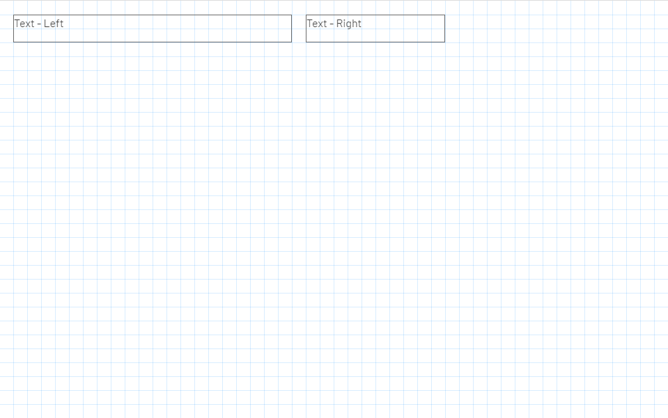
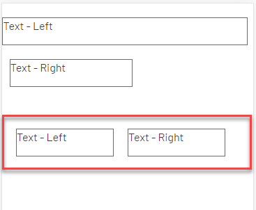
We’re going to start with a blank bubble page and place two text elements on it side by side:
When this page is rendered on a small device, you would think that it would wrap the excess width to the next row, right?
Unfortunately, that is NOT what happens as you can see in this next image:
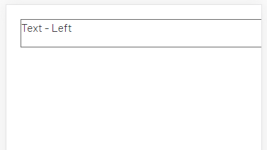
Instead, the page allows for horizontal scrolling which is not the best UX for a mobile device.
The reason for this behavior is because the page, by default, is set to a FIXED WIDTH:
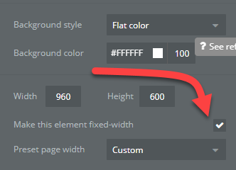
Once unchecked, the PAGE canvas can grow or shrink with the device.

Hence we have our FIRST rule:
RULE #1: Do NOT make pages fixed-width.
Side By Side
What if you wanted to have the two text elements side by side, in two columns on a mobile device?
The easiest way to do this is to set each element to be the same width and positioned equally on the left and right side of the page:
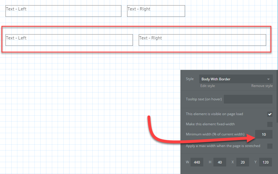
And you also need to set the minimum width to something much smaller than the default – we set it to 10%. This means that the Bubble.io rendering engine will set the width of the object to at least 10% of the proportioned width of the original size of the element. If you set this too high, then it will make the element too wide on the mobile device and always force the second column to the next row.
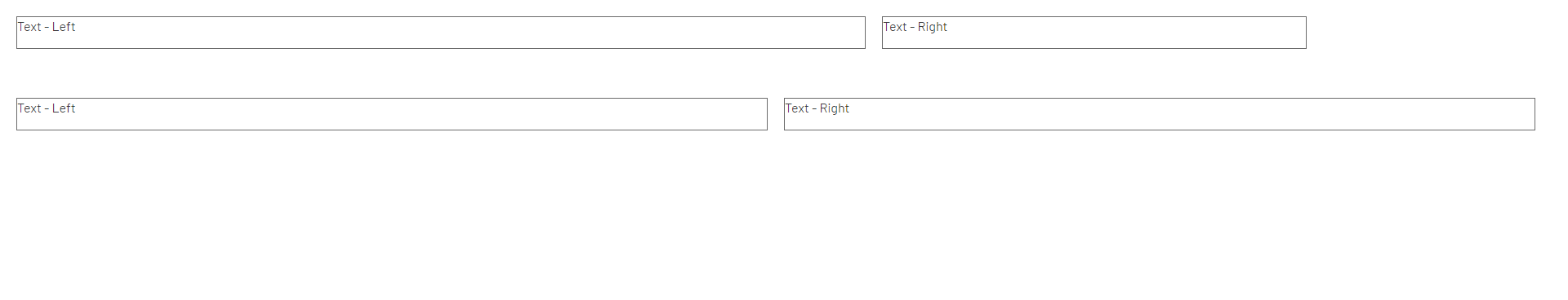
With this configuration it will render on a mobile device as follows:
Cool, right? There’s just one tiny problem – when on a desktop, all the fields will render very very wide:
The fix for this is simple: Specify a MAXIMUM width for each element:
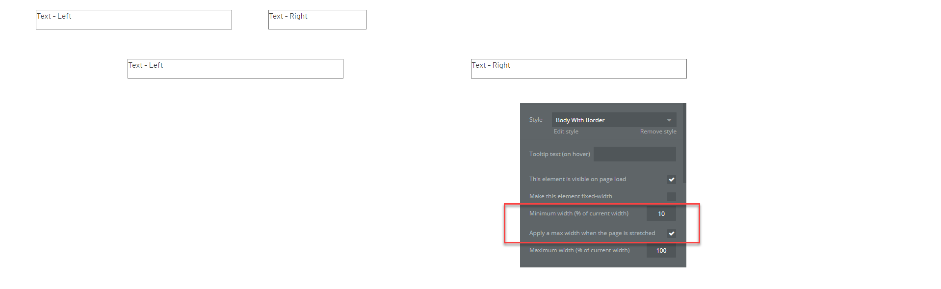
So, for this scenario we:
- Made each element equal width
- Set a minimum width
- Set a maximum width (optional if you don’t want the fields fully stretch)
Coming Next
We’ll be updating this article over the next few weeks to cover:
- Groups of elements
- Combining Buttons, Inputs & Labels
- Setting text and field heights
- Page layouts using Groups