
Introduction
This article provides an overview of the standards and general practice we encourage our developers to use when creating apps on the Bubble.io platform. It is intended for our own developers and is being shared so that others can benefit from it.
As you might expect, this is a work in progress.
These recommendations will necessarily change over time as the types of apps we create increase and we grow our customer base.
It covers the following general areas:
- Visual environment setup
- Naming standards
- Documentation guidelines
- Guidelines for using PWA techniques vs individual pages
- Responsive guidelines
And any other items we can think about that requires standardization to make it easier for multiple developers to work on the same app.
Note that we do not generally start our apps from existing templates purchased from the Bubble.io store. But if you ever have to use a template because it’s a client requirement, you should try to follow the guidelines in that template. If the template does not seem to have standards, then your new code or modified code should follow the standards outlined in this document.
Common Mistakes
Before we get to the meat of our standards, lets talk about two common mistakes we see when we evaluate developers’ projects.
Common Mistake #1
Most bubble developers will either spend a lot of time in the Bubble RESPONSIVE tool or they will create two pages that duplicate functionality – one for desktops and one for mobile.
This is wrong on so many levels.
Bubble’s responsive engine is quite good – if you know how to set it up properly. In most cases you should only create ONE page for a function, not two pages.
If you find yourself spending more than a few minutes per day in Bubble’s responsive tool you probably need to rethink the layout of your screen. Of course, some clients will have designs that leave you no choice; but if you have a choice or flexibility to move things around, then it is possible to layout your screens so that Bubble automatically and intelligently handles the resizing for you.
We’ll give you pointers below on how to set this up.
Common Mistake #2
The other issue we see a lot is that developers put EVERYTHING on one screen because it’s supposed to run on mobile. This effectively makes the app a PWA app.
The problem with this approach is that all workflows end up in the same place. And most developers don’t even bother to use folders. So a developer who is new to an app might end up facing a screen that looks like this:
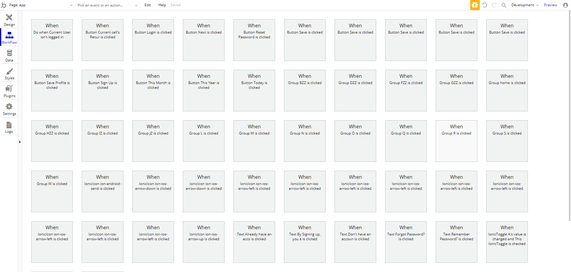
Yikes.
Even the original developer of something like this will likely need to spend a lot of time poking around if they leave the project for a bit and rejoin in a few weeks.
The solution to this workflow hell is to use the Bubble PWA technique just for the screens used most often by the end user. For screens that are used less often, create separate pages instead.
And use workflow folders on the PWA screen.
In a PWA app, you’re generally showing and hiding groups. Workflows inside each group that would normally go on a separate page should go into their own workflow folder.
Ok, now that we’ve covered those two common mistakes, lets move on to your basic environment…
Setting Up Your Bubble Environment
The first thing you want to do is set your grid size. This should 20px. This is the amount that will serve as padding inside each of your groups.
Second, turn on the snap elements to grid option – it will help when you move things around, snapping them to the 20px boundary lines.
Set your page width to 960px. Why? Because it is easily divisible by all numbers up to 6 so that you can create up to six columns that Bubble’s responsive engine can automatically resize for you.
Even if you’re creating a mobile app, you can use the 960px size to make it easier to visually work instead of having to work with a tiny viewport.
Your page height will vary based on the contents of the page. We suggest setting that to 960px as well but you can resize longer and shorter based on the page contents.
Pages should not be set to a fixed width – instead they should be set to have a minimum width of 33 (which would mean that the smallest screen supported would be 33% of 960 or 320px.)
Creating Your Page Layouts
Most page layouts will start with a header, footer and a body in the middle.
The means that you need to add at least three groups to your page:
- Floating group for header pinned to the top of your page. This can be a standard group if you don’t want the header visible all the time, such as when you’re creating a website and not a webapp.
- Floating group for footer pinned to the bottom of our page. Again, This can be a standard group if you don’t want it visible all the time, such as when you’re creating a website and not a webapp.
- The body.
Each of these groups should span the entire width of the page – i.e; be 960px in width.
The names of these groups should be as follows (we’ll cover naming standards later)
- FloatingGroup pageHeader (or Group pageHeader)
- FloatingGroup pageFooter (or Group pageFooter)
- Group contentArea
Everything you add to the page will go inside these three groups.
For the admin dashboard, we’ll be adding a fourth group – the side bar to hold the admin menu options. We will cover this later but suffice to say that the contentArea group will shrink a bit so that the left bar group can be added.
If you add something to a page that is not inside a group, Bubble’s responsive engine gets wacky and unpredictable in its placement of those elements. Which is why you always have at least one group on your page. And for most apps you’ll be nesting groups to create additional columns and such.
Multiple Columns
How do you handle creating multiple columns if we have only one contentArea? (Columns are simply Bubble.io groups.)
There are two ways to handle this:
- Create separate column groups instead of one contentArea. In this case you’ll name the columns as follows: Group leftContentArea, Group rightContentArea, Group centerContentArea. If you have more than three columns, then you’ll name them based on number: Group contentAreaColumnOne, Group contentAreaColumnTwo etc.
- Create the columns inside the contentArea group. This just means that you’ll have larger padding in some areas.
Recommended reading
The folks over the buildcamp.io have an amazing tutorial on how to properly build out responsive page layouts in Bubble. A lot of our page layout recommendations are straight out of that resource. You can find it here and we strongly recommend that you purchase and read it! It’s 52 pages of easy reading. Every time we read it we pick up something new. https://buildcamp.io/guide/mastering-design-in-bubble. If you’re building for bubble it will likely be the best 29.00 or so you’ve ever spent.
Fixed sizes
In general you do not want your elements to have fixed sizes. The following items are exceptions to this:
- Buttons
- Icons
- Images used as avatars
Other than the items listed above, size all your elements’ widths to take up the full width of the group, leaving a 20px buffer on all sides
This means that you can add your buttons in one of two places: Flushed left or centered. Bubble will handle the responsiveness just fine. But adding them to the right of the screen is a little trickier.
Naming Standards
The general rule here is to proactively NAME EVERYTHING. Do NOT use the default names that Bubble creates for you.
Here are the rules for your names:
Pages
Page names should start with the text ‘page’. The full name should be lowercased with each word separated by a dash. This format is known as ‘kebab-case’. For example: page-user-login.
Visual Objects (such as text, inputs etc.)
There are two types of visual objects:
- Active Objects – eg: buttons, inputs etc.
- Passive Objects – eg: labels for input fields.
For both types of visual objects, the first part of a name is the type of object (eg: Group, Input etc.) – bubble usually adds that for you. The second part is your name that indicates what the object does.
For Passive Objects we use camelCase. eg: Group pageHeader.
The final portion of the name is not needed for everything. But for things like field labels and the title you might place at the top of the page, you should end the object name with “label” or “title”. For example, a label for a birthday field might be “Text birthdayLabel”. A label at the top of a sign up page might be named “text signUpPageTitle”.
For active objects we use lowercase with a ‘-‘ to separate the words (aka kebab-case).
Because you’re naming everything, it’s easy to distinguish what you actually need when choosing from one of Bubbles’ list in the Bubble UI. For example, if you have a field called date-of-birth with a label inside of a group that shows the field and an icon, you’ll end up with multiple elements referencing date of birth. For example:
- group dateOfBirth
- input date-of-birth
- icon dateOfBirth (passive or non-clickable element)
- icon date-of-birth (active or clickable element)
- text dateOfBirthLabel
Examples of names for active elements:
- input date-of-birth
- icon date-of-birth
- button date-of-birth
Database Tables and Fields
Table Names should have each word capitalized and separated by dashes. Eg:
- Document-Type
- Policy-Type
Table names should always be SINGULAR. So, “Document-Type” instead of “Document-Types”.
Field names should be lower case with dashes separating individual words (kebab-case). For example:
- role
- income-bracket
- last-name
Table names (aka “things”) should have the first word capitalized. And plurals should not be used. For example:
- Post instead of “Posts”, “posts” or “post”
- Bank-Account instead of “Bank-accounts” or “bank-account” or “bank_acount”
Custom States
Custom state names should ALWAYS start with ‘cs’. Eg: ‘csActionType’ or ‘cs-action-type’. We prefer the latter option, (aka kebab-case) with the dashes when developing new apps (we used to specify the former so you’ll see that on older apps.)
Custom states should be attached to the object to which it is most closely aligned or related. We know that most other professionals recommend that states be attached to the page. But we prefer keeping states with the element to which it’s most closely related. By doing it this way, when the element is deleted, the state goes with it instead of remaining behind as an orphaned state that is easy for a developer to forget about.
If you do decide to add all your custom states to the page, at least include the element name closest to which the state is associated in the custom state name. You are then responsible for making sure that unused states are removed to avoid confusing future developers.
Each custom state should ALWAYS be documented! Describe what it’s used for, who uses it and how it relates to other workflows!
Option Sets
Option set names should be prefixed with “OS”. For example:
- OS-User-Role
- OS-Appointment-Status
Notice that each word is separated by a dash and capitalized.
Custom Events
Custom event names should ALWAYS start with ‘ce’. Eg: ‘ceRedirectToLogin’ or ‘ce-redirect-to-login’.
When naming custom events, there are two names – the event name itself and the display name shown in the workflow “box”. The display name should start with “Custom Event” – that clearly indicates to other developers that the box contains a workflow for a custom event.
Misc
When using icons, put each icon into a group and use the CLICKED event on the group for your workflows. Why? Because if you ever have to change out the icon library you’ll lose your workflows. By keeping the workflows on the group, you are free to switch the icons or the icon libraries or even put text inside the group without inadvertently losing your workflows.
Documentation Standards
Each element in bubble has a place where you can add documentation. Use them liberally.
- Every table must have documentation on it. In particular, there should be an explanation of how a table relates to other tables.
- Common fields do not need to be documented. For example, a field called “first-name” is pretty obvious. But other fields should have some level of documentation, especially if they contain special values or if they are used in or to trigger business-specific functions.
- All custom states must have their own documentation on it. Why does it exist, what is expected to update it and what is expected to use its value.
- Most steps of a multi-step workflow should probably be documented. If you don’t think a step should be documented, ask yourself if your future-self will know what the heck you were doing 12 months prior.
If there is ever any doubt, ALWAYS err on the side of more documentation, not less.
Version Control
Bubble does not really have version control the way classic development does. There is no such thing as ‘git’ for Bubble. Which means that we need to manually do some things to give us some semblance of it.
First, you should create a NAMED save-point at least once per day. If you know you’re about to make a major change, create one as well. This will eventually save your a$$.
Second, if the app you’re working on is on a paid plan (not our Agency Plan), use the export option at bottom of the Bubble SETTINGS->GENERAL tab to export out a JSON representation of the app. Then, use a local GIT repo or a private cloud git repo to check-in the file. Over time you’ll learn how to read the exports to get an idea of the changes you’ve made between commits.
Under no circumstances should you check-in these JSON files to a public repository. They contain all api keys and private information that have been set-up in the app!
Finally, if you’re on an Agency Plan with admin rights, you should make a habit of cloning the app on a regular basis. If all else fails, you can revert to one of the copies. Of course, delete old copies as you see fit.
Revision History
From time-to-time we make changes to this document. We summarize the changes here.
- 10-26-2021: Added naming standards for pages since it was inexplicably omitted from the original version.
- 09-20-2021: First official public version. Prior versions were for internal use only.